Questionnaire Components Guide
This guide covers the shared components that help building frontends to manage FHIR based questionnaires. They help with:
- Loading questionnaires from a questionaire server or the the Welshare API
- Managing response state (supports flat or nested structures)
- Rendering different question types
- Validation and error handling
- Progress tracking
- Submitting response data to Welshare profiles
Installation
The component library is published on NPM: https://www.npmjs.com/package/@welshare/questionnaire
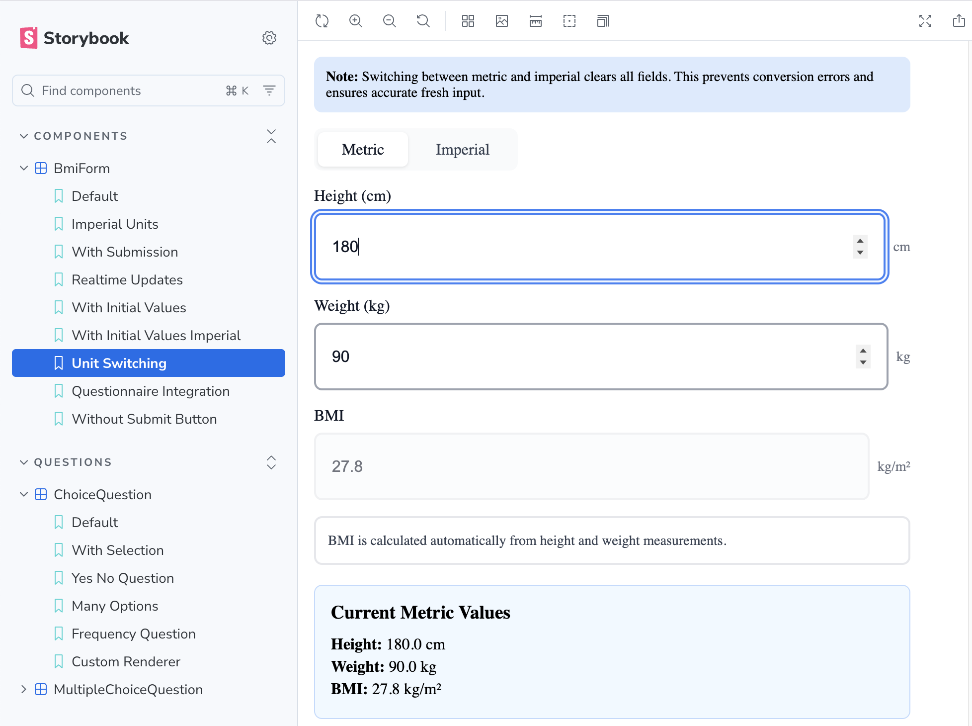
A storybook that demonstrates the use of some basic components: https://welshare-questionnaire-storybook.vercel.app/
Components
QuestionnaireProvider
A context provider that manages questionnaire state, responses, and validation.
Props
questionnaire: Questionnaire- The FHIR Questionnaire object to render (clients are responsible for loading/fetching the definitions)questionnaireId?: string- Optional questionnaire ID to use in the response. If not provided, will usequestionnaire.id. If neither exists, an error will be thrown.useNestedStructure?: boolean- Whether to use nested (hierarchical) or flat response structure (default:true)children: ReactNode- Child components
Example
import { QuestionnaireProvider, Questionnaire } from "@welshare/questionnaire";

function App() {
  const [questionnaire, setQuestionnaire] = useState<Questionnaire | null>(
    null
  );

  useEffect(() => {
    // Client is responsible for fetching the questionnaire
    async function loadQuestionnaire() {
      const response = await fetch(
        "https://api.welshare.app/api/questionnaire/your-id"
      );
      const data = await response.json();
      setQuestionnaire(data);
    }
    loadQuestionnaire();
  }, []);

  if (!questionnaire) return <div>Loading...</div>;

  return (
    <QuestionnaireProvider
      questionnaire={questionnaire}
      questionnaireId="optional-override-id" // Optional: defaults to questionnaire.id
      useNestedStructure={true}
    >
      <YourQuestionnaireComponents />
    </QuestionnaireProvider>
  );
}
useQuestionnaire Hook
Access questionnaire state and methods from any component within QuestionnaireProvider.
Available Methods
const {
  questionnaire, // The questionnaire object (from provider props)
  response, // Current questionnaire response
  updateAnswer, // Update a single answer
  updateMultipleAnswers, // Update multiple answers (for repeating questions)
  getAnswer, // Get a single answer by linkId
  getAnswers, // Get all answers for a linkId (for repeating questions)
  isPageValid, // Check if all required questions on a page are answered
  getRequiredQuestions, // Get required questions from a page
  getUnansweredRequiredQuestions, // Get unanswered required questions
  markValidationErrors, // Mark validation errors for display
  clearValidationErrors, // Clear all validation errors
  hasValidationError, // Check if a specific question has a validation error
  debugMode, // Boolean indicating if debug mode is enabled
  toggleDebugMode, // Function to toggle debug mode on/off
} = useQuestionnaire();
QuestionRenderer
Renders individual questionnaire items based on their type.
Supported Question Types
coding- Single select (radio) or multiple select (checkbox) with coded answersinteger- Number input (with optional slider control)decimal- Decimal number inputquantity- Numeric input with unit selectionstring/text- Text inputboolean- Yes/No radio buttons
Special Features
- Hidden Fields: Questions with
questionnaire-hiddenextension are automatically hidden - Slider Controls: Integer questions can use slider controls via extension
- Custom Text Answers: Choice questions can allow free-text "Other" input via
answerConstraint - Quantity with Units: Numeric input with unit selection for measurements
- Exclusive Options: Multi-select questions can have exclusive options (e.g., "None of the above")
- Max Answers: Limit the number of selections in multi-select questions
- Validation Errors: Automatically displays validation state
Props
interface QuestionRendererProps {
  item: QuestionnaireItem;
  className?: string; // Custom class for container
  inputClassName?: string; // Custom class for input elements
  choiceClassName?: string; // Custom class for choice options
  choiceLayout?: "stacked" | "inline-wrap"; // Choice layout mode (default: "stacked")
  renderRadioInput?: (props: RadioInputProps) => ReactNode; // Custom radio button renderer
  renderCheckboxInput?: (props: CheckboxInputProps) => ReactNode; // Custom checkbox renderer
}
Custom Renderer Props:
Both renderRadioInput and renderCheckboxInput receive the following props:
linkId: string- The question item's linkIdvalueCoding?: { system?: string; code?: string; display?: string }- The option's value codingvalueInteger?: number- The option's integer value (if applicable)checked: boolean- Whether this option is currently selecteddisabled?: boolean- Whether this option is disabledonChange: () => void- Callback when the option is selected/toggledlabel: string- The display text for this optionindex: number- The index of this option in the list
Example
import { QuestionRenderer, useQuestionnaire } from "@welshare/questionnaire";

function QuestionnairePage() {
  const { questionnaire } = useQuestionnaire();

  if (!questionnaire?.item) return null;

  return (
    <div>
      {questionnaire.item.map((page) => (
        <div key={page.linkId}>
          <h2>{page.text}</h2>
          {page.item?.map((question) => (
            <QuestionRenderer key={question.linkId} item={question} />
          ))}
        </div>
      ))}
    </div>
  );
}
Custom Input Renderers
You can provide custom renderers for radio buttons and checkboxes to integrate with your design system:
import {
  QuestionRenderer,
  type RadioInputProps,
  type CheckboxInputProps,
} from "@welshare/questionnaire";

function QuestionnairePage() {
  return (
    <QuestionRenderer
      item={questionItem}
      renderRadioInput={(props: RadioInputProps) => (
        <label className="custom-radio">
          <input
            type="radio"
            checked={props.checked}
            onChange={props.onChange}
          />
          {props.label}
        </label>
      )}
      renderCheckboxInput={(props: CheckboxInputProps) => (
        <label className="custom-checkbox">
          <input
            type="checkbox"
            checked={props.checked}
            onChange={props.onChange}
            disabled={props.disabled}
          />
          {props.label}
        </label>
      )}
    />
  );
}
LegalConsentForm
A self-contained form component for collecting user consent before data submission. This component handles consent collection with required (Terms & Conditions and Privacy Policy) and optional (Study invitation notifications) checkboxes.
Integration Pattern
This component provides the form content for a consent dialog. Applications should wrap it in their own Dialog/Modal component (from shadcn/ui, Radix UI, MUI, etc.) to match their design system.
Props
interface LegalConsentFormProps {
  initialValues?: Partial<LegalConsentResult>; // Restore previous preferences
  documentLinks?: { termsUrl?: string; privacyUrl?: string }; // Custom document URLs
  onConfirm?: (result: LegalConsentResult) => void; // Called when confirmed (terms accepted)
  onCancel?: () => void; // Called when user declines
  onChange?: (result: LegalConsentResult) => void; // Real-time updates on any checkbox change
  renderCheckbox?: (props: LegalCheckboxProps) => ReactNode; // Custom checkbox renderer
  confirmButtonLabel?: string; // Default: "Confirm & Continue"
  cancelButtonLabel?: string; // Default: "Cancel"
  className?: string; // Additional CSS classes
}

// Result object
interface LegalConsentResult {
  termsAccepted: boolean; // Required - T&Cs and Privacy Policy
  studyConsentAccepted: boolean; // Optional - Study invitations
}
Custom Checkbox Integration
Provide a custom checkbox renderer to integrate with your design system:
import { LegalConsentForm } from "@welshare/questionnaire";

<LegalConsentForm
  renderCheckbox={({ id, checked, onCheckedChange, className }) => (
    <CustomCheckbox
      id={id}
      checked={checked}
      onCheckedChange={onCheckedChange}
      className={className}
    />
  )}
  onConfirm={handleConsent}
  onCancel={handleCancel}
/>;
Available CSS Classes
.wq-legal-consent-form- Main form container.wq-legal-consent-section- Individual consent section.wq-legal-consent-heading- Section headings.wq-legal-consent-checkbox-row- Checkbox and label row.wq-legal-consent-link- Links to legal documents.wq-legal-consent-info-box- Information box (study consent details).wq-legal-consent-actions- Button container.wq-button,.wq-button-primary,.wq-button-outline- Button styles
For a complete example with a Dialog wrapper, see the package README.
Utility Functions
Progress Calculation
import { calculateProgress, getVisiblePages } from "@welshare/questionnaire";

const pages = getVisiblePages(questionnaire);
const progress = calculateProgress(currentPageIndex, pages.length);
// Returns percentage: 0-100
Question Utilities
import {
  getAllQuestionsFromPage,
  hasAnswerValue,
  isQuestionHidden,
  getExclusiveOptionCode,
} from "@welshare/questionnaire";

// Get all questions from a page (flattens nested groups)
const questions = getAllQuestionsFromPage(pageItem);

// Check if an answer has a value
const hasValue = hasAnswerValue(answer);

// Check if a question should be hidden
const isHidden = isQuestionHidden(questionItem);

// Get exclusive option code (if any)
const exclusiveCode = getExclusiveOptionCode(questionItem);
Styling
The questionnaire components use a modern CSS architecture with design tokens and scoped class names.
Import CSS Files
Import both the design tokens and styles:
// Import design tokens (CSS custom properties)
import "@welshare/questionnaire/tokens.css";

// Import component styles
import "@welshare/questionnaire/styles.css";
Design Tokens (CSS Custom Properties)
All styles are built on CSS custom properties that you can easily override:
/* Override design tokens in your own CSS */
:root {
  /* Colors */
  --wq-color-primary: #your-brand-color;
  --wq-color-border: #custom-border-color;

  /* Spacing */
  --wq-space-lg: 1.5rem;

  /* Typography */
  --wq-font-size-lg: 1.25rem;
  --wq-font-weight-medium: 600;

  /* Borders & Radius */
  --wq-radius-md: 0.75rem;
  --wq-border-width: 1px;
}
Available Design Tokens
Spacing: --wq-space-{xs,sm,md,lg,xl,2xl}
Font Sizes: --wq-font-size-{sm,base,lg,xl}
Font Weights: --wq-font-weight-{normal,medium,semibold,bold}
Border Radius: --wq-radius-{sm,md,lg,full}
Colors:
- Neutral:
--wq-color-gray-{50...900} - Primary:
--wq-color-primary-{50,100,200,500,600,700} - Error:
--wq-color-error-{50,500,600} - Semantic:
--wq-color-{background,surface,border,text-primary,selected}
Transitions: --wq-transition-{fast,base,slow}
Shadows: --wq-shadow-{sm,md,focus}
Scoped CSS Classes
All classes use the .wq- prefix to avoid conflicts:
.wq-question-container- Main container for each question.wq-question-container.wq-has-error- Error state.wq-question-text- Question text.wq-required-indicator- Required asterisk.wq-question-choice- Choice question container.wq-choice-option- Individual choice option.wq-choice-option.wq-selected- Selected choice.wq-choice-option.wq-disabled- Disabled choice.wq-question-input- Text/number inputs.wq-question-slider- Slider container.wq-slider-input- Slider input element.wq-progress-bar- Progress bar container.wq-progress-fill- Progress bar fill
Custom Styling
You can add custom styles in three ways:
1. Override Design Tokens (Recommended):
:root {
  --wq-color-primary: #6366f1;
  --wq-radius-md: 0.5rem;
}
2. Override Scoped Classes:
.wq-choice-option {
  box-shadow: 0 2px 4px rgba(0, 0, 0, 0.1);
}
3. Pass Additional Classes via Props:
<QuestionRenderer
  item={question}
  className="my-custom-class"
  inputClassName="my-input-class"
  choiceClassName="my-choice-class"
/>
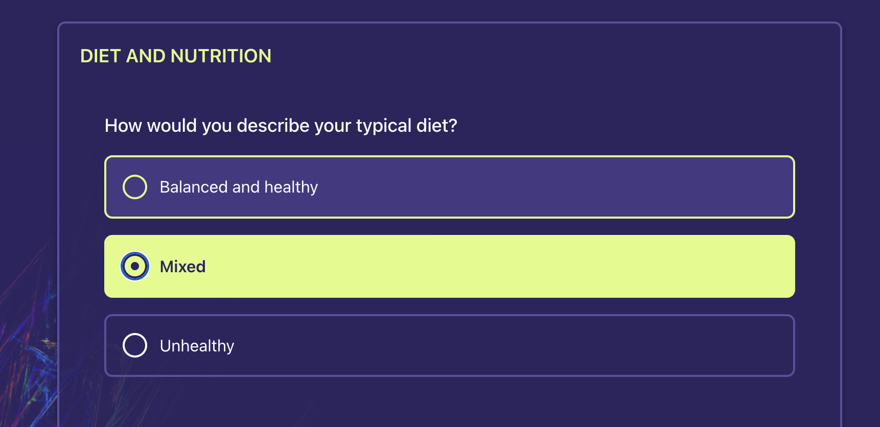
Choice Layout
Choice questions support two layout modes via the choiceLayout prop. This applies to coding, choice, and boolean question types.
| Mode | Behavior |
|---|---|
"stacked" (default) | Vertical column, one option per row |
"inline-wrap" | Horizontal chips that wrap to the next line |
<QuestionRenderer item={item} choiceLayout="inline-wrap" />
The container emits a layout class (.wq-choice-layout-stacked or .wq-choice-layout-inline-wrap) alongside .wq-question-choice and any choiceClassName you pass.
Chip Tokens
When using inline-wrap, these tokens control chip appearance:
:root {
  --wq-choice-chip-radius: 9999px; /* pill shape */
  --wq-choice-chip-padding-x: 1rem;
  --wq-choice-chip-padding-y: 0.5rem;
  --wq-choice-chip-gap: 0.5rem;
}
Example: Dark Chip Theme
Combine the layout prop with token overrides and a scoped CSS file for a dark chip UI:
<QuestionRenderer
  item={item}
  choiceLayout="inline-wrap"
  choiceClassName="questionnaire-choice"
/>
/* Theme tokens */
:root {
  --wq-color-surface: hsl(246 65% 10%);
  --wq-color-border: hsl(234 50% 20%);
  --wq-color-selected: hsl(214 98% 52%);
  --wq-color-selected-border: hsl(214 98% 52%);
  --wq-color-text-primary: hsl(220 20% 95%);
  --wq-choice-chip-radius: 14px;
}

/* Scoped brand overrides */
.wq-question-choice.questionnaire-choice .wq-choice-option.wq-selected {
  background: var(--wq-color-selected);
  border-color: var(--wq-color-selected-border);
}

/* Optional: hide native radio/checkbox for pure chip look */
.wq-question-choice.questionnaire-choice input[type="radio"],
.wq-question-choice.questionnaire-choice input[type="checkbox"] {
  position: absolute;
  inline-size: 1px;
  block-size: 1px;
  opacity: 0;
  pointer-events: none;
}
Keep overrides scoped to your choiceClassName and use package state classes (.wq-selected, .wq-disabled) rather than custom state selectors. See the package README for the full token and class reference.
Complete Example
Here's a complete example of a questionnaire page with navigation:
import { useState, useEffect } from "react";
import {
  QuestionnaireProvider,
  useQuestionnaire,
  QuestionRenderer,
  getVisiblePages,
  calculateProgress,
  type Questionnaire,
} from "@welshare/questionnaire";
import "@welshare/questionnaire/tokens.css";
import "@welshare/questionnaire/styles.css";

function QuestionnairePage() {
  const {
    questionnaire,
    response,
    isPageValid,
    markValidationErrors,
    clearValidationErrors,
    debugMode,
    toggleDebugMode,
  } = useQuestionnaire();

  const [currentPageIndex, setCurrentPageIndex] = useState(0);

  const pages = getVisiblePages(questionnaire);
  const currentPage = pages[currentPageIndex];
  const progress = calculateProgress(currentPageIndex, pages.length);
  const isCurrentPageValid = currentPage?.item
    ? isPageValid(currentPage.item)
    : true;

  const handleNext = () => {
    if (isCurrentPageValid) {
      clearValidationErrors();
      setCurrentPageIndex((prev) => prev + 1);
    } else {
      markValidationErrors(currentPage.item || []);
    }
  };

  const handlePrevious = () => {
    if (currentPageIndex > 0) {
      setCurrentPageIndex((prev) => prev - 1);
    }
  };

  const handleSubmit = async () => {
    if (isCurrentPageValid) {
      // Submit the response to your API
      // Note: For Welshare submission, use @welshare/react package
      console.log("Submitting response:", response);
      // await submitToYourAPI(response);
    } else {
      markValidationErrors(currentPage.item || []);
    }
  };

  return (
    <div className="questionnaire-container">
      <h1>{questionnaire.title}</h1>

      {/* Debug Mode Toggle */}
      <button onClick={toggleDebugMode}>
        {debugMode ? "Disable" : "Enable"} Debug Mode
      </button>

      {/* Progress Bar */}
      <div className="wq-progress-bar">
        <div className="wq-progress-fill" style={{ width: `${progress}%` }} />
      </div>
      <p>
        Page {currentPageIndex + 1} of {pages.length}
      </p>

      {/* Current Page Questions */}
      <div className="questionnaire-page">
        <h2>{currentPage.text}</h2>
        {currentPage.item?.map((question) => (
          <QuestionRenderer key={question.linkId} item={question} />
        ))}
      </div>

      {/* Navigation Buttons */}
      <div className="navigation-buttons">
        <button onClick={handlePrevious} disabled={currentPageIndex === 0}>
          Previous
        </button>

        {currentPageIndex < pages.length - 1 ? (
          <button onClick={handleNext}>Next</button>
        ) : (
          <button onClick={handleSubmit}>Submit</button>
        )}
      </div>
    </div>
  );
}

function App() {
  const [questionnaire, setQuestionnaire] = useState<Questionnaire | null>(
    null
  );
  const [isLoading, setIsLoading] = useState(true);
  const [error, setError] = useState<string | null>(null);

  useEffect(() => {
    async function loadQuestionnaire() {
      try {
        const response = await fetch(
          `${process.env.API_BASE_URL}/api/questionnaire/${process.env.QUESTIONNAIRE_ID}`
        );
        if (!response.ok) throw new Error("Failed to load questionnaire");
        const data = await response.json();
        setQuestionnaire(data);
      } catch (err) {
        setError(err instanceof Error ? err.message : "Unknown error");
      } finally {
        setIsLoading(false);
      }
    }
    loadQuestionnaire();
  }, []);

  if (isLoading) return <div>Loading questionnaire...</div>;
  if (error) return <div>Error: {error}</div>;
  if (!questionnaire) return <div>No questionnaire found</div>;

  return (
    <QuestionnaireProvider questionnaire={questionnaire}>
      <QuestionnairePage />
    </QuestionnaireProvider>
  );
}
Note: For submitting questionnaire responses to Welshare, you'll need to use the @welshare/react package which provides the useWelshare hook and Schemas export. See the Welshare React SDK documentation for details.
FHIR Extensions Support
Custom Text Answers (answerConstraint)
FHIR R5 allows choice questions to accept free-text "Other" responses using answerConstraint:
{
  linkId: "referral-source",
  type: "coding",
  answerConstraint: "optionsOrString",
  answerOption: [
    { valueCoding: { code: "search", display: "Search engine" } },
    { valueCoding: { code: "social", display: "Social media" } },
  ]
}
- Single-select (
repeats: false): Coded option or free text (mutually exclusive) - Multi-select (
repeats: true): Coded options and free text coexist
Quantity Questions with Units
Use the standard FHIR questionnaire-unitOption extension:
{
  linkId: "waist",
  type: "quantity",
  text: "What is your waist circumference?",
  extension: [
    {
      url: "http://hl7.org/fhir/StructureDefinition/questionnaire-unitOption",
      valueCoding: {
        system: "http://unitsofmeasure.org",
        code: "cm",
        display: "cm",
      },
    },
    {
      url: "http://hl7.org/fhir/StructureDefinition/questionnaire-unitOption",
      valueCoding: {
        system: "http://unitsofmeasure.org",
        code: "[in_i]",
        display: "in",
      },
    },
  ]
}
Multiple units display as a toggle; single unit shows as label; no units falls back to simple decimal input.
Hidden Questions
{
  extension: [
    {
      url: "http://hl7.org/fhir/StructureDefinition/questionnaire-hidden",
      valueBoolean: true,
    },
  ];
}
Slider Control
{
  extension: [
    {
      url: "http://codes.welshare.app/StructureDefinition/questionnaire-slider-control",
      extension: [
        { url: "minValue", valueInteger: 0 },
        { url: "maxValue", valueInteger: 100 },
        { url: "step", valueInteger: 1 },
        { url: "unit", valueString: "minutes" },
      ],
    },
  ];
}
Note: The slider control extension URL in the code uses http://codes.welshare.app/StructureDefinition/questionnaire-slider-control, but the extension structure should match the format above.
Exclusive Option (for multi-select)
{
  extension: [
    {
      url: "http://codes.welshare.app/StructureDefinition/questionnaire-exclusive-option",
      valueString: "none-of-the-above-code",
    },
  ];
}